Pauline LISI • Portfolio
SOL, LA, SEE ♪♫
SOLO MOVIE • 2022
“Sol, La, See ♪♫” is an individual 45-second movie made for the end of the 3rd year and allowing us to validate or not our passage to the 2nd cycle of our studies. I had 4 months to make this little film, from the main idea to the final result.
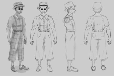
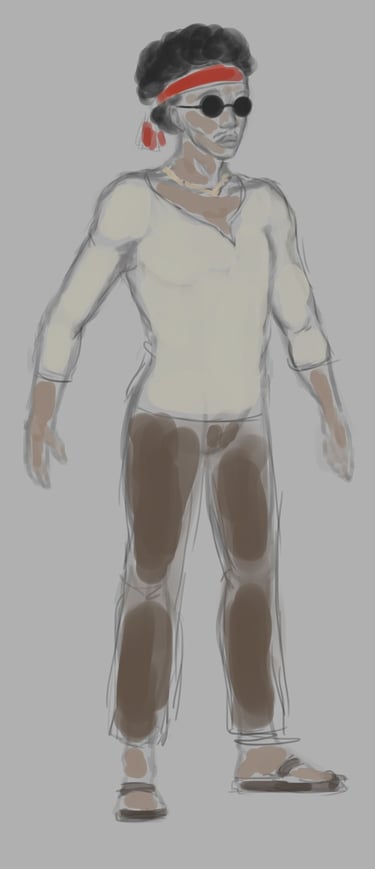
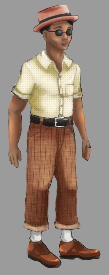
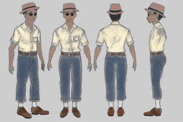
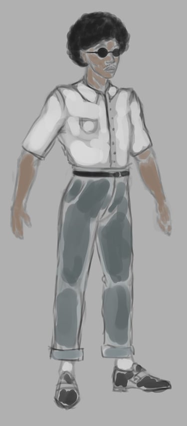
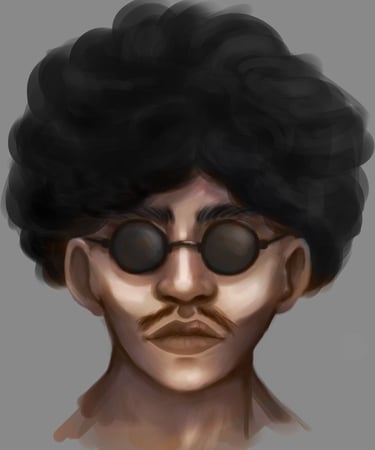
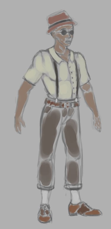
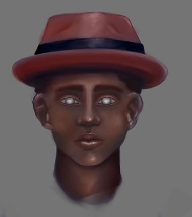
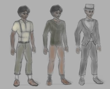
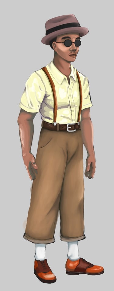
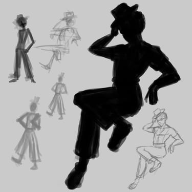
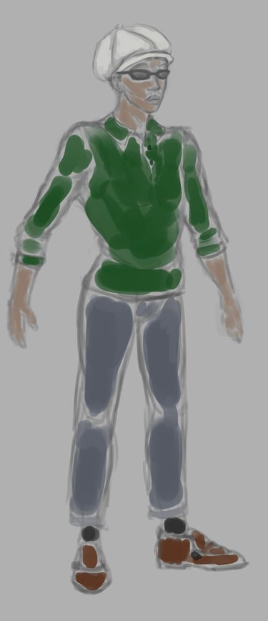
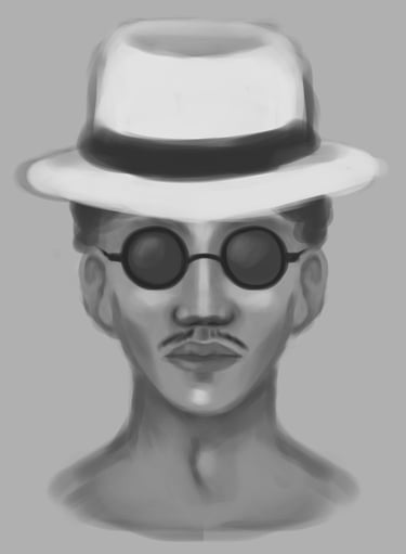
The theme of this project was "color". So, I chose to tell the story of a colored character (Keon) who cannot see them (the colors) because of his blindness. My story takes place in an era full of color, between the 60s and 70s in the United States. Thanks to his gift for the piano, Keon manages to create his own internal and colorful universe.
I directed this film entirely. It's not perfect in every way, but I'm extremely proud of myself and for having been able to carry my project through to the end. The only thing I didn't do was music. I used royalty-free music: “Jazz Piano Bar” by Doug Maxwell which completely matched my graphic universe.
I have a lot of regrets about the making of my film, particularly in terms of lighting, compositing, artistic direction and surfacing. With my current level, I could have done much better. But I still remain happy with the final result and to have been able to take up and accomplish this big challenge successfully.

ALL ASPECTS
STORYBOARD


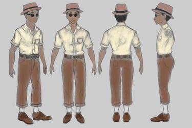
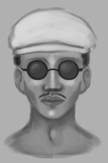
CONCEPT ART


TOPOLOGY


SURFACING


RIGGING
• To make a 45-second film entirely alone
• To learn a complete 3D pipeline
• Lighting ► As said above, I have a lot of regrets regarding my Lighting. With my current outlook, I see all the flaws in my project and I spend my time saying to myself “ah, if only I could have done it today, I would have done so much better…”. My lighting is not elaborate and does not highlight my character, it doesn't say anything. In the future, I no longer want to have any regrets when it comes to lighting, so I always plan to think about it and raise awareness about it, by asking myself the right questions: why am I placing my light here? What do I want to tell with my light?
• Surfacing ► Just like my lighting, I am not proud of my surfacing. It's not detailed, it's bland. In the future, I will do a much more detailed and constructed surfacing
• Modeling ► My modeling presents problems, particularly in terms of human proportions. In the future, I plan to work with many more references, in order to get as close as possible to realistic proportions
• Rig and Animation ► My project was very (too) ambitious at this level. I'm not the strongest at rigging and animation, although those are skills I'd like to improve for my personal work. My rig has lots of flaws that prevented me from animating my character the way I wanted. Likewise, my animation is not at all natural or realistic, we feel that I have a lot of weakness in terms of organic animation. In the future, I will work with a lot more references and attention to detail so that my work can be as visually pleasing as possible
• Compositing ► My compositing is not very elaborate. I certainly really like my visual effects (done on After Effects), but the transition from the real world to Keon's imaginary world is frankly not incredible. In the future, now that I know how to use a Pref correctly, I will ensure that the transitions in my compositing are as discreet as possible, so that my integrations appear natural
WHAT I LEARNED ?
WHAT CAN I IMPROVE IN MY FUTURE PROJECTS ?
